
The Power of Responsive Web Design: Elevating User Experience Across Devices
650 Views |
Introduction:
In the dynamic landscape of the digital age, where smartphones, tablets, and desktops are integral to our lives, having a website that adapts seamlessly to various screen sizes is not just a luxury, but a necessity. This blog delves into the significance of responsive web design and how it enhances user experience across different devices.
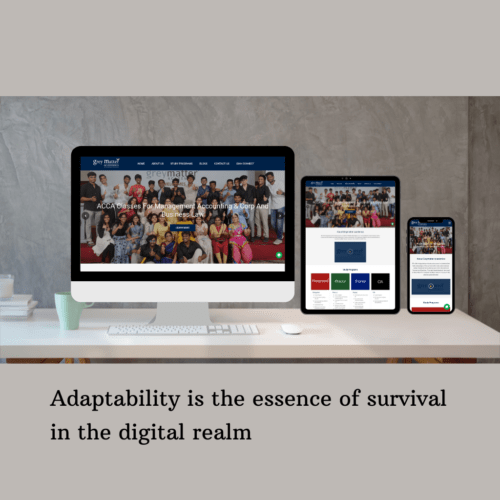
Understanding Responsive Web Design
Responsive web design is a design approach that aims to create websites that automatically adjust their layout and elements to fit various screen sizes. This fluidity ensures that users have a consistent and enjoyable browsing experience, regardless of whether they access the site from a smartphone, tablet, or desktop.
The Impact on User Experience
User experience is paramount in today’s competitive digital landscape. Responsive design guarantees that visitors can navigate and interact with your website effortlessly. Whether they’re swiping through your product catalog on a mobile device or exploring your content on a larger screen, a positive user experience fosters engagement and conversions.
Boosting Accessibility and Reach
With the rise of mobile internet usage, ensuring your website is accessible to users on all devices is crucial. Responsive design eliminates the need for creating separate mobile versions of your site, making it easier for users to find and navigate your content. This inclusivity expands your reach and potential customer base.
Search Engine Friendliness
Search engines prioritize user experience and mobile-friendliness in their ranking algorithms. A responsive website not only provides a better experience for visitors but also stands a better chance of ranking higher in search engine results. This means increased visibility and organic traffic to your site.
Crafting Consistency in Branding
Maintaining a consistent brand identity is essential for building trust and recognition. Responsive design ensures that your branding elements, such as logos, colors, and fonts, remain intact across all devices. This cohesiveness reinforces your brand message and fosters a sense of familiarity among users.
The Technical Magic Behind It
Responsive design employs a combination of flexible grids, media queries, and CSS rules to adapt a website’s layout and content. Media queries play a pivotal role by detecting the user’s device characteristics and adjusting the design accordingly. This technical finesse guarantees a smooth and optimized user experience.
Key Considerations for Implementation:
- Prioritize Content: Identify the most crucial content and features to display prominently on smaller screens.
- Optimize Images: Use responsive images that load quickly and look sharp on all devices.
- Test Thoroughly: Test your website on various devices and browsers to ensure consistent performance.
- Font Legibility: Choose fonts that are readable across different screen sizes.
- Mobile-First Approach: Design for mobile devices first and then scale up for larger screens.
Conclusion: In a world where user expectations are ever-evolving, responsive web design emerges as a vital strategy for enhancing user experience across devices. By seamlessly adapting to different screens, your website becomes a versatile tool for engaging with potential customers. Embrace responsive design to stay relevant, improve SEO, and leave a lasting impression on your audience.
Ready to transform your website’s user experience? Partner with Kiluvai Tech Solutions for expert Bootstrap development services that ensure a responsive and captivating online presence. Elevate your brand today!